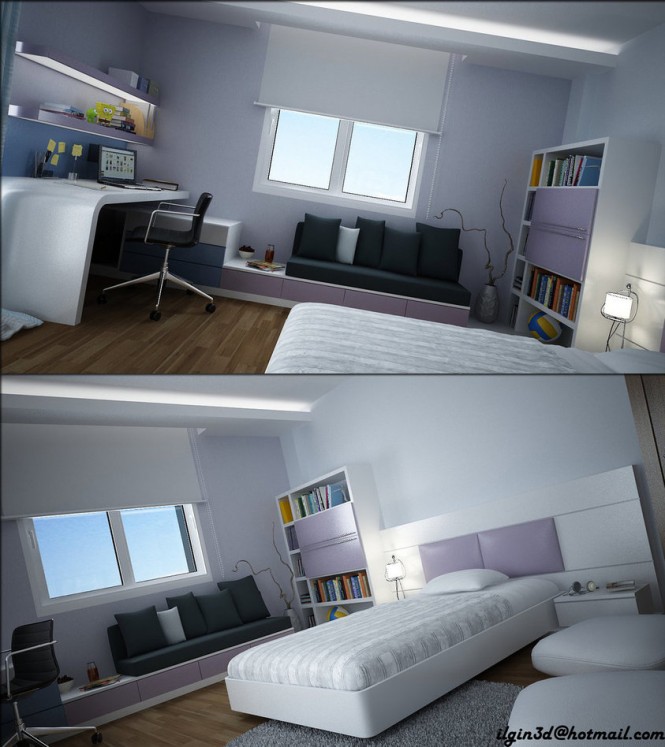
Since the 2012 IKEA Catalog was launched (we also featured a preview not too long ago), we decided to brake it down into categories, so you guys could have an easier access to the products presented by the giant furniture manufacturer. Here are a few bedroom ideas that caught our attention and that we believe you will find inspiring. According to IKEA, the catalog features “everything from chests of drawers and wardrobes to beds and mattresses – at prices that will let you sleep at night“. Moreover, the company developed online guides helping customers choose the best mattresses, quilts and pillows. In the photos below you will find some clever bedroom ideas, incorporating cool storage solutions and fresh decorating details. Without further ado, here our some of the best IKEA bedroom designs for 2012. As usual, we are looking forward to your reactions. See anything in there that would suit your bedroom?


Ahhhh, the joys of jacquard, floral and paisley patterns on the wall…Is this how good it felt when wallpaper was invented? Except today we shall marvel over the trendy pops of color and bold whimsical patterns infused into and inspired by our contemporary lifestyle. These wallpaper designers have no easy job and pay close attention to contemporary trends to create some smoking hot wallpaper designs that have a modern but nostalgic feel to them. What an investment to install wallpaper that makes you happy the day you put it up, but what happens if you get tired of it? Then again we also wonder if tie-die will ever come back into style as wallpaper… Either way, Carpe Diem and enjoy these designs by Graham and Brown!


Young people take a lot of pride in the way they set up their room. Though grown-ups often feel that a child’s space should feed and nurture their creativity, curiosity, and ability to focus, the space usually ends up as one that shows off the child’s passions. As each has their own unique tastes and needs, it would be rare to find two that are alike. In this set of young workspaces we focus on a few that sport a special creative flair.
The first five images are designs by Turkish interior designer, Akcalar and the last five are by Barcelona designer, Sergi Mengot.
The first five images are designs by Turkish interior designer, Akcalar and the last five are by Barcelona designer, Sergi Mengot.
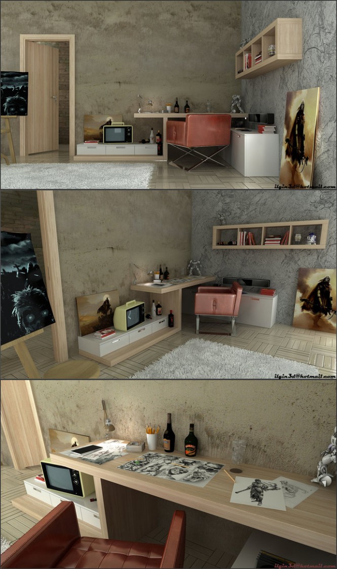 |
| Here, Akcalar strips down the rustic design style to end up with a simple yet rugged artist’s workspace. |
 |
| Here is a modern, young person’s room, decorated with a touch of color and a modern workspace. |
There is nothing better to calm those jittery nerves than a soothing bath. Scented candles, refreshing salts and oil and some music in the background are sure to revitalize your senses. However, your experience will be incomplete without a perfect bathroom set.
Pearl Baths have introduced contemporary and traditional bathroom design ideas that are sure to steal a few looks. These designs have a rich mix of serene colors and textures that help you enjoy the perfect bath.
These ideas can come in handy for those thinking to remodel their bathrooms or for those who are building them up from scratch. Either way, these beautiful bathroom designs can work wonders for your home.


In riding the coattails of our rustic dining rooms article, we wanted to shine some light on these beautiful bedrooms inspired by the same classic styles of Roche Bobois. Only this time the subtle and sophisticated take on modern classic decor is distinguished and gives us a glimpse of hope in making this beautiful era relative to our contemporary and multi-cultural lives.
Now, some of their furniture only appears ancient because of the antique aging process and hand-waxed lacquer finish but the detail in craftsmanship is undeniable so we won’t hold that against them. Using metallic fabrics and bold color in unexpected places while remaining true to the idiosyncratic fashion of the old world is simply a great combination for any period room. Wouldn’t it be grand to wake up in one of these royal-sized beds with the sun shining into your massive french windows as you examine the finishing touches of such flawlessly elaborate architecture and ponder the meaning of life? We’d like to think so…
Here you will see Baroque and Medieval inspired bedrooms with a modern flair. We only hope you come back to reality soon enough to enjoy our next post!


Inspiration from the land of dragons and emperors! Today we are featuring some living room designs from Pinchen Design, a Chinese based designer whose rooms exude comfort and luxury. Using texture, pattern and colour the rooms have been designed with real application in mind.It might be hard to pick a favourite!
The warmth of natural timbers and leather result in a welcoming living room. With the open fire on it would be a haven in winter.


To anyone who knows Carlos Martínez, Gensler principal and firmwide design leader in Chicago, it must have come as a surprise when he announced he'd be trading his Miesian high-rise lifestyle for the Gilded Age opulence of the Gold Coast. He and his partner, communications consultant Michael Tirrell, have been collecting art over the past 20 years-the kind of modern and contemporary work most often imagined in stripped-down, crisp white environs. The transition would call for back-to-square-one strategizing and the subtle manipulation of everything from the floor plan to the finishes.
In a bit of serendipity, Martínez once worked as a junior architect at Holabird & Root-known as Holabird & Roche back in 1897, when it completed the eight-story apartment house. The concept of vertical living was not very appealing at that time, especially to the socially registered residents of the mansions that anchored the nascently tony neighborhood. "I feel a kinship with the building's first occupants, who obviously were open to progressive ways of thinking about social and economic status. Chicago had just hosted the World's Columbian Exposition, and the mind-set was to move away from Victorian fuss in favor of a cleaner neoclassicism," he says. During his research on the building, he also discovered that modernist pioneer László Moholy-Nagy lived in this very apartment soon after moving from Germany to direct the New Bauhaus school. (Later, he founded what would become the Institute of Design at the Illinois Institute of Technology.)
There were decades of fusty upgrades to remove to get back to the 3,000-square-foot apartment's original interior, then decisions to be made as to how much of that interior could be altered with integrity. "Architecture is here to stay. Furniture and artwork are transient. It isn't a coincidence that the Spanish word for furniture, muebles, also means movable," Martínez explains. That said, he removed awkward walls to combine the servants' quarters and butler's pantry with the tiny kitchen. Most meals for the early residents were served from a communal kitchen, but people simply don't live in the same Upstairs Downstairs manner as they used to.
After the 19th-century floor plan was altered to accommodate 21st-century appetites, leaving heating lines and plumbing pipes exposed in the new kitchen, he transformed them into "columns" clad in crimson tile. And he concealed a shaft-facing window behind an ingenious frosted-glass box lined with dimmable halogen fixtures. "Since there wasn't any view, I designed one," he says. The view into the breakfast room, meanwhile, is dominated by a massive photograph of Julia Child-a souvenir of a memorial exhibition organized by Gensler. Formerly a maid's room, it can now morph into a comfortable guest suite, thanks to pocket doors, a Murphy bed, and a revamped bathroom.
The idea of defining a view dictated how all the art is hung. "I think of the picture moldings as frames focusing the eye on a painting," Martínez says. He restored the moldings, where needed, after removing the previous owner's floor-to-ceiling bookshelves. "Besides covering up beautiful original details, they made the rooms smaller," he explains. Because ripping out the shelves unfortunately left a discolored lip running around the perimeter of the floor's quarter-sawn white-oak strips, he painstakingly refinished them with archival wax-more difficult to maintain but offering a depth impossible to achieve with synthetic products. That same previous owner had also installed an inordinate number of closets, and these have now been reduced. Martínez is no fan of closet doors either, so he replaced most of them with weighty cotton velvet curtains. As he explains it, "Doors need so much clearance, whereas curtains are beautiful and economical." While absorbing sound and exuding richness, they free up wall space for the ubiquitous works of art. They're protected from damaging sunshine by UV film, applied to the windows, as well as by sheer white shades.
With the nearly three-year rehab now complete, the couple, their vizsla, Blue, and their collection have settled in with aplomb-and one significant addition, a remembrance of their previous high-rise home. Each hallway there was themed to a different artist, and they lived on the Gene Davis floor, so Tirrell surprised Martínez with a pair of Davis lithographs. "We walked by those striped prints constantly. I'd like to do a whole wall of them someday," Martínez says, scanning his already art-filled rooms for a place to make that happen.